 CleverHeap
 Vladimir Marinkovic
Introduction
Keycloak is an open-sourced identity server and identity broker that provides many authentication protocols. It’s popular use and development track record found him a place under umbrella of CNCF projects. Once, you set to use it in your project (previously covered in a blog post), you’ll probably end up using the default Keycloak server pages for the flows of login, registration, change password etc. In almost all cases, you will want to adjust and customize your display that fits to your project or brand theme. In this blog post, we’ll describe perhaps the easiest approach to achieve this.
Keycloakify
Keycloak provides a mechanism to work and build templates using Apache FreeMaker. It can support significant UI adjustments that most cases would deem sufficient, but if you decide to go a step further and have more flexibility on your UI/UX you can reach the limit of that support. Also, it requires some time to learn the ropes and all necessary configuration to build such templates.
In order to ease and provide more flexibility in working with Keycloak templates, project Keycloakify was introduced. It allows you to customize the look and feel of your pages, email templates and to improve UX where required. In supports React/Angular/Svelte, but you can also use static HTML, combined with any UI libraries (e.g. MUI, Bootstrap, TailwindCSS) of your preference.
How it works
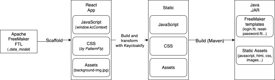
As mentioned before, Keycloak leverages on Apache FreeMaker FTL templates for creating themes. Those templates are used to generate static HTML pages. What Keycloakify does, is it translates FTL templates’ models into JSON as global context together with React/Angular/Svelte components. This way, for example, you can perform customizations on different React pages and build static files that are then bundled into Java .jar file. This .jar file will be composed with convention that Keycloak can interpret as a custom theme.
Draft a theme
Following the official guides, we start by cloning the keycloakify-starter project:
git clone https://github.com/keycloakify/keycloakify-starter
Once we have cloned the repository, we can leverage a use of Storybook to test and inspect our UI changes more conveniently. Storybook is a catalog of your components and a way to see your changes in real-time which is more convenient then running or restarting a frontend app.
To add components, run following command and navigate (with arrow keys) to component you want to include:
npx keycloakify add-story
In the command output, referent login templates are all marked (x) by default, so you can proceed and hit Enter.
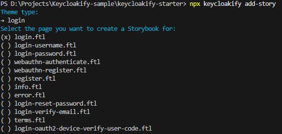
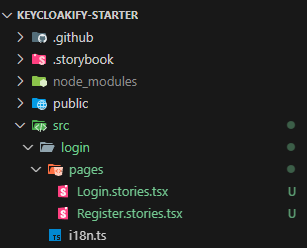
To include additional template for Storybook, repeat a process and navigate to different .ftl item (e.g. register.ftl). In the end, you should see two items under src/<your_theme_name>/pages (if theme name was not specified, your theme name will be login).
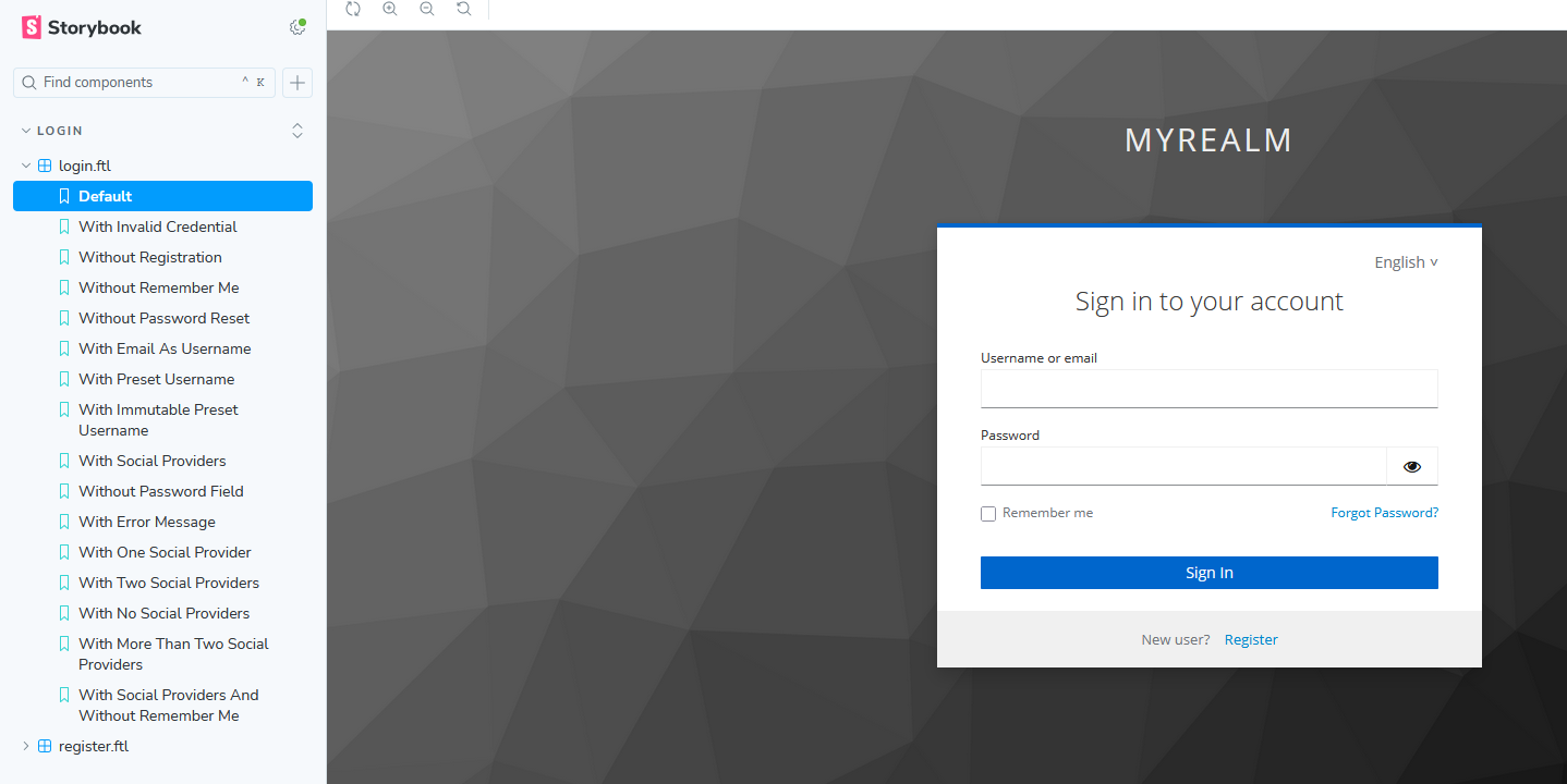
Run a Storybook catalog by executing the following command:
npm run storybook
Now you should see a navbar that shows all pages relevant to Keycloak templates that you have previously included.
Changing background image
Place your background image either under /public directory or under src/<your_theme_name>/assets. The first option will allow hot reload, i.e. to replace image without rebuilding .jar theme. Create a main.css file and override following style class property for background image. Add a correct path depending on you background image placement (e.g. in case of assets use ./assets/<your_image>.png).
body.kcBodyClass {
  background: url(./background.png) no-repeat center center fixed;
}
To make css globally applied, add following import to the KcPage.tsx:
import "./main.css";
...
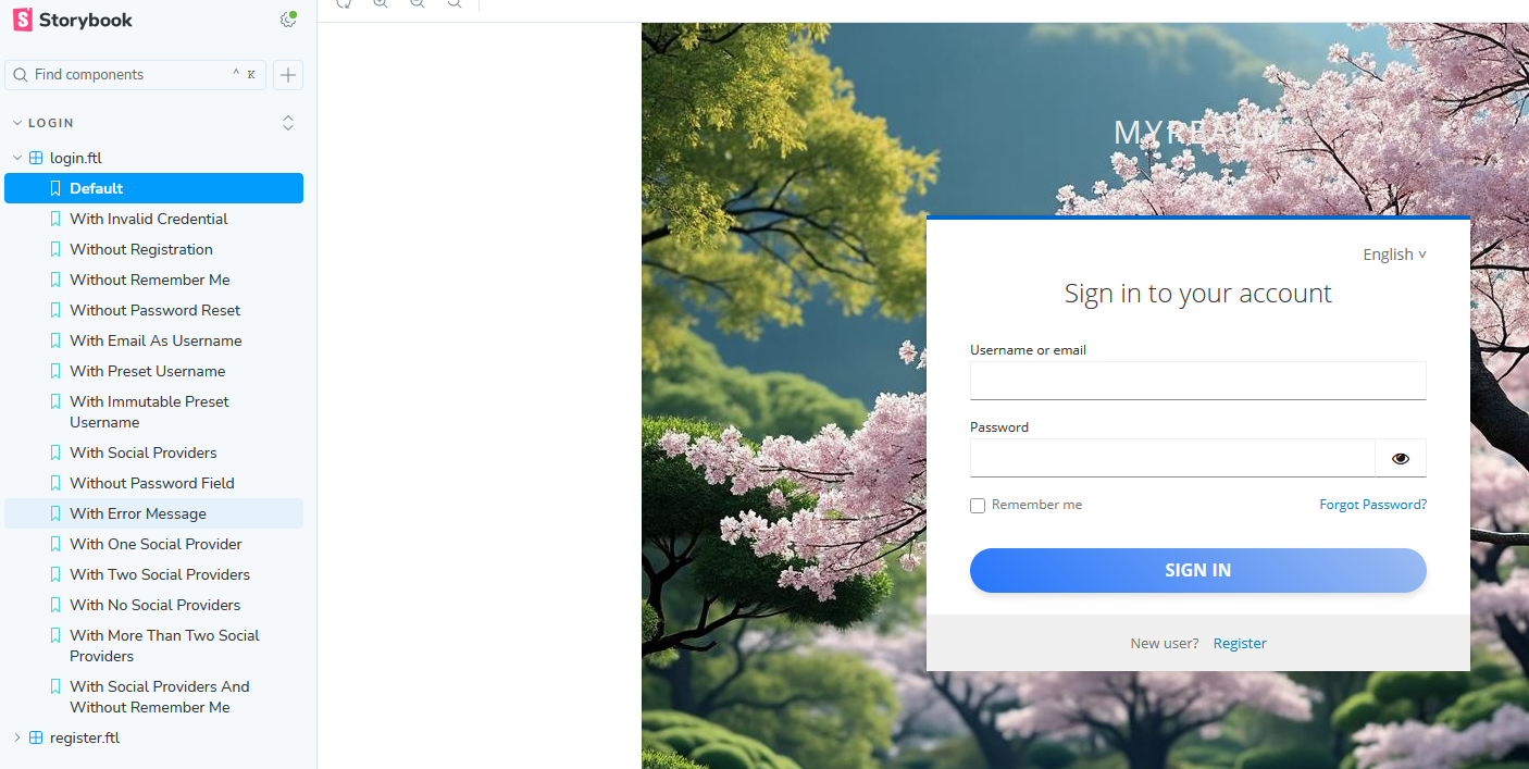
Now, you can check that background image has changed in Storybook.
Custom styling
If you inspect Storybook’s pages and their HTML elements in your browser, you’ll notice that they all have some variant of kcClass applied (kc is short for Keycloak). Overriding these classes allows us to adjust UI to our display needs. With the following CSS style, we’ll modify the button design from the default theme.
body.kcBodyClass {
  background: url(./background.png) no-repeat center center fixed;
}

.kcButtonClass {
  padding: 10px 20px;
  font-size: 16px;
  font-weight: bold;
  text-transform: uppercase;
  color: #ffffff;
  background: linear-gradient(45deg, #2575fc, #9dbcf1ff);
  border: none;
  border-radius: 25px;
  box-shadow: 0 4px 6px rgba(0, 0, 0, 0.1);
  transition: transform 0.2s, box-shadow 0.2s;
  cursor: pointer;
  width: 100%;
}

.kcButtonClass:hover {
  transform: translateY(-2px);
  box-shadow: 0 6px 8px rgba(0, 0, 0, 0.2);
}

.kcButtonClass:active {
  transform: translateY(0);
  box-shadow: 0 2px 4px rgba(0, 0, 0, 0.2);
}

.kcButtonClass:focus {
  outline: none;
  box-shadow: 0 0 0 3px rgba(37, 117, 252, 0.5);
}

.kcButtonClass:disabled {
  background: linear-gradient(45deg, #aaa, #ccc);
  color: #666;
  cursor: not-allowed;
  box-shadow: none;
  transform: none;
  opacity: 0.6;
}

.kcButtonClass:disabled:hover,
.kcButtonClass:disabled:active {
  transform: none;
  box-shadow: none;
}
As always, you can check the changes in Storybook.
Changing HTML
What if we want to change actual HTML in page? To do that, we first need to run eject-page and Keycloakify will scaffold appropriate page for you:
npx keycloakify eject-page
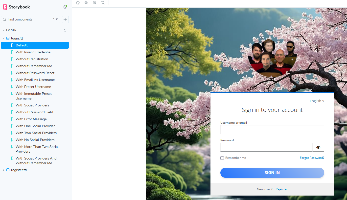
If we choose, for example, login.ftl it will generate the Login.tsx under src/your_theme_name/pages/. Then you can edit a login form to adjust it to your needs. However, if you want to change something in a global layout that is used on every page, you’ll have to eject Template.tsx. This template will be available under /src/your_theme_name/Template.tsx. We’ll demonstrate editing of layout by changing Logo image that needs to be applied to all the pages.
First, add Logo image to public folder. Then change the Template.tsx file by replacing default realm display name with logo image element.
...
import logoPngUrl from "../../public/logo.png";
...
<div className={kcClsx("kcLoginClass")}>
  <div id="kc-header" className={kcClsx("kcHeaderClass")}>
      <div id="kc-header-wrapper" className={kcClsx("kcHeaderWrapperClass")}>
          {/* {msg("loginTitleHtml", realm.displayNameHtml)} */}
          <img src={logoPngUrl} width={200} />
      </div>
  </div>
...
The output in Storybook should be something similar:
Localization
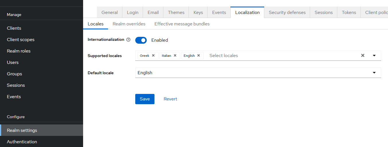
Keycloak server supports many different locales, so in many cases it is sufficient to enable localization and choose the languages you want to support. Once the changes are saved, your pages will use default language and every page will have a drop down selector for changing supported locales.
On the other hand, if your language is not among supported locales, Keycloakify can utilize i18n library and add your custom localization resources as additional Keycloak locales. Downside is that you’ll have to translate a lot of text messages that appear on Keycloak’s pages, so the choice that presents itself is to translate only the subset (for pages that you will use) or to use AI tools or online translators to automatically translate those messages to designated language.
As a first step, go to node_modules/keycloakify/src/login/i18n/messages_defaultSet/en.ts copy that file to your src/your_theme_name folder and rename en.ts to i18n.[designated_local].ts with appropriate designated local (see ISO list).
Translate the content of your new i18n.[designated_local].ts file by using LLM or some other tool. As the last step, add your local to the list of external locales by editing /src/your_theme_name/i18n.ts and adding withExtraLanguages():
/* eslint-disable @typescript-eslint/no-unused-vars */
import { i18nBuilder } from "keycloakify/login";
import type { ThemeName } from "../kc.gen";

/** @see: https://docs.keycloakify.dev/features/i18n */
const { useI18n, ofTypeI18n } = i18nBuilder
  .withThemeName<ThemeName>()
  .withExtraLanguages({
    bs: {
      label: "bosnian",
      getMessages: () => import("./i18n.bs"),
    },
  })
  .build();

type I18n = typeof ofTypeI18n;

export { useI18n, type I18n };
In the previous code, replace bs and label: "bosnian" for your designated local. Also, notice your file name should not include .tsx extension.
Export theme
Once we are finally done with crafting our theme we should bundle it in .jar file for Keycloak server. Since we need to compile it with Java, it is prerequisite we have Maven installed. To install Maven use package installer like Brew, Chocolatey or similar:
#with Brew
brew install maven

#with Choco
choco install maven
To build your theme run following command:
npm run build-keycloak-theme
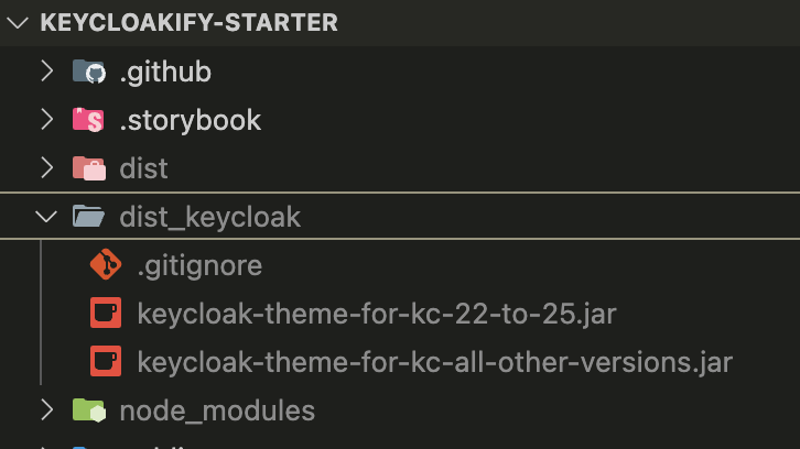
Once complete, you will see multiple .jar files under dist_keycloak folder. Depending of the version of your Keycloak server you’ll need to use appropriate .jar file.
Theme set up
Once we have set up our Keycloak server (see previous post) and configured a new Realm, we can see that our login page would use a default Keycloak theme.
To add our new theme in Keycloak options we need to copy one of the generated .jar files to /opt/keycloak/providers/<generated_theme_file>.jar destination.
In case of docker-compose we would use volume mount:
keycloak:
    image: quay.io/keycloak/keycloak:26.1.4
    container_name: keycloak
    ...
    volumes:
      - ./.keycloak/keycloak-theme-for-kc-all-other-versions.jar:/opt/keycloak/providers/keycloak-theme.jar
...
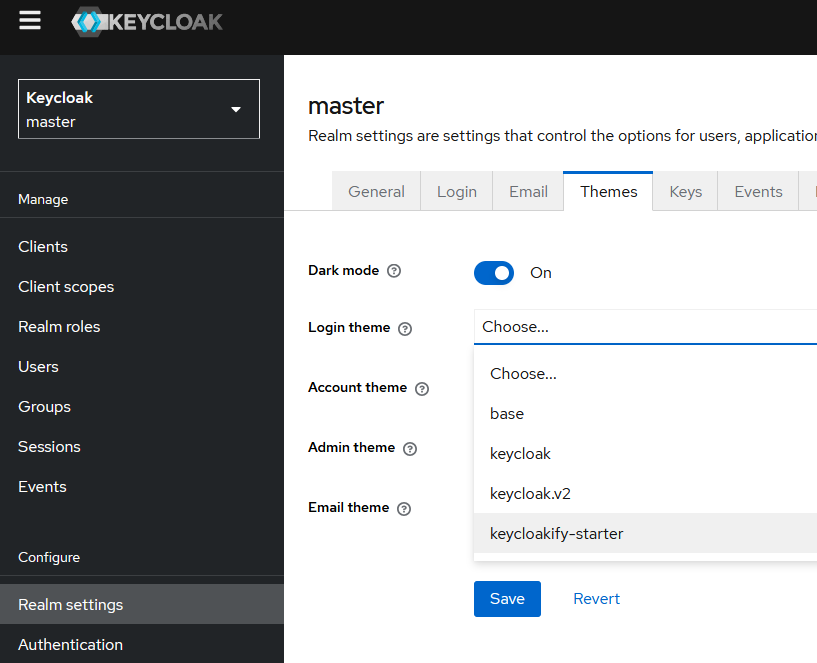
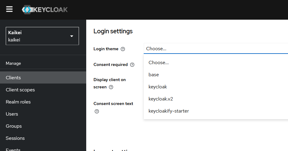
Once your server is set with a new theme, you’ll be able to use it in both Realm Settings or Client Settings.
|
|
|
Keycloak Realm settings and themes
|
Keycloak Client settings and themes
|
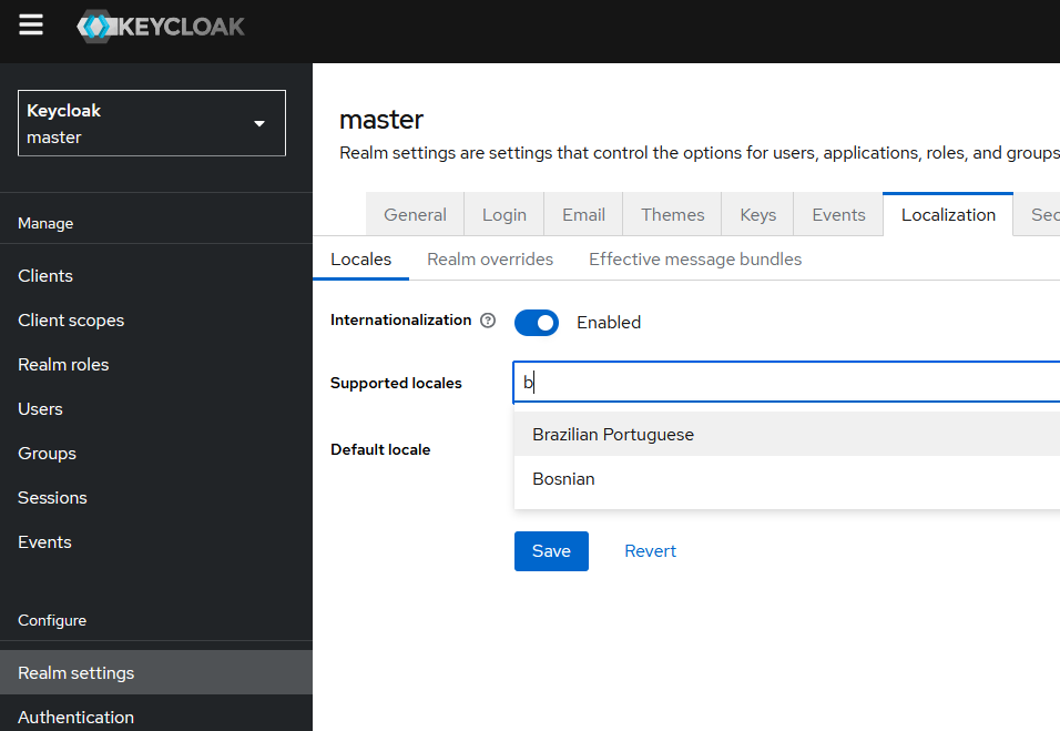
For localization part, you can check that in the list of supported languages in Realm Settings your additional local is listed.
Conclusion
Hopefully, this covers the most of the stuff necessary for customizing Keycloak pages. Compared to the alternatives, we can safely presume Keycloakify is a way to go. If you decide to explore more options, I’d recommend checking out the official Keycloakify docs where you can find far more guidelines.